Last Updated on March 4, 2024 by Tim Wells
Are you tired of the same old look of your Kodi media center? Want to give it a fresh and exciting new skin?
Look no further. We’ve compiled a list of the top 15 Kodi skins to give your media center a makeover.
We’ve got you covered, from sleek and modern to retro and nostalgic. Plus, we’ll show you how to easily install them on your device with only a few clicks.
So, whether you’re a seasoned Kodi user or just getting started, here are some of our favorite Kodi skins and how to install them.
How to Install Kodi Skins
Installing a new Kodi skin is super-easy and only takes a few steps.
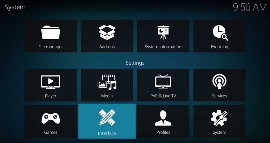
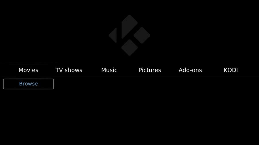
Start by going to your Settings Menu
Click on Interface.
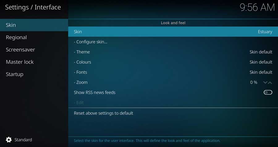
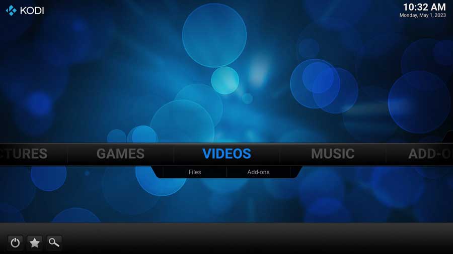
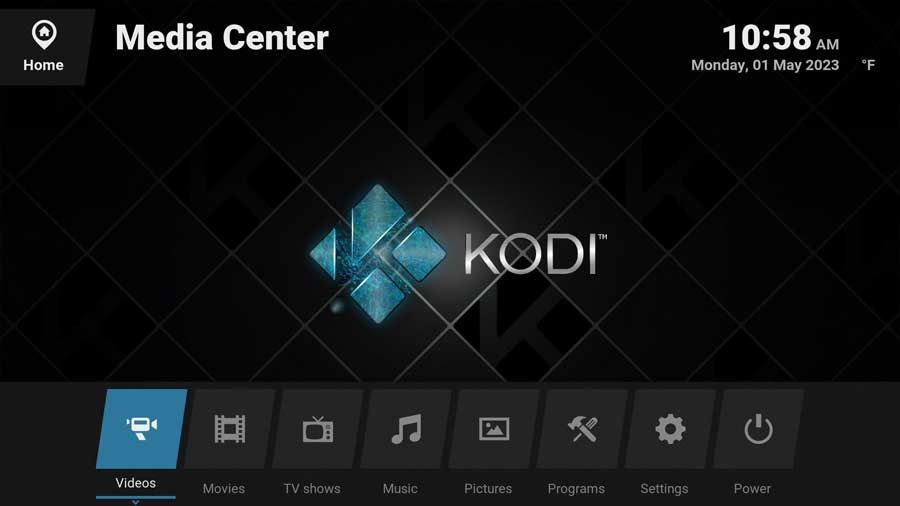
The current skin is highlighted. In this case, it’s Estuary, the default skin for Kodi 18 (Krypton), 19 (Leia), and 20 (Matrix).
Clicking on it opens a menu box that shows any skins you have installed on your device. You can switch back and forth between them here or click “Get More…” to download a new Kodi skin.
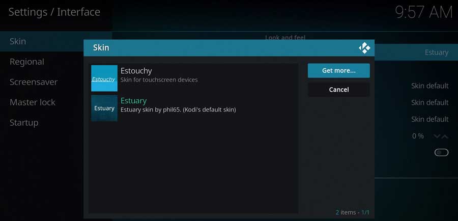
Scroll through the list until you find the skin you want to try.
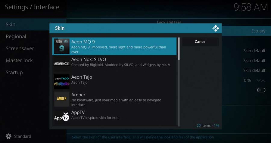
The new skin and any add-on dependencies will automatically download and install.
Click Yes to keep this skin.
The Best Kodi Skins
In this section, we present our handpicked selection of the best Kodi skins available.
Each skin offers a distinct look and feel, enabling you to tailor your Kodi experience to match your personal style and preferences.
Dive in and find the perfect skin for your Kodi installation.
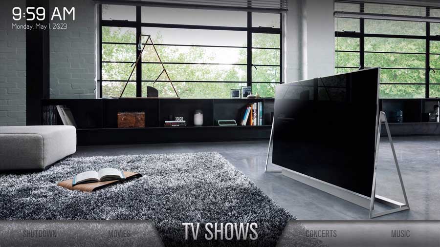
Aeon MQ9 Kodi skin
Aeon MQ9 is Kodi’s newest version of the popular Aeon skin series. It features a clean and elegant design, with eye-catching images that match each menu’s theme. The interface is visually appealing and easy to navigate, making it enjoyable for Kodi users.
The settings menu feels cluttered, but the home screen of Aeon MQ9 is still user-friendly. It has an ‘upscale’ look, combining style and simplicity for an improved Kodi experience.
Arctic Zephyr Reloaded
Arctic Zephyr Reloaded is a beautiful, minimalist Kodi skin that incorporates current movie news from the internet.
This feature provides users with information about upcoming movies or ones in theaters, adding a unique touch to this skin. However, the novelty might wear off over time, as you’re reminded of this every time you open Kodi.
The Settings menu in Arctic Zephyr Reloaded is well-designed and easy to navigate, consistent with the overall theme. Arctic Zephyr Reloaded is a unique option for users looking for a minimalist yet engaging Kodi skin with the added bonus of movie news.
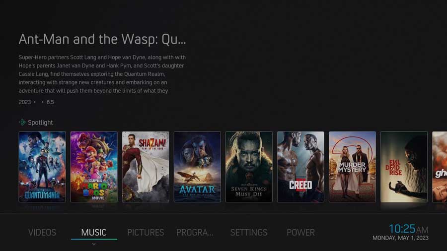
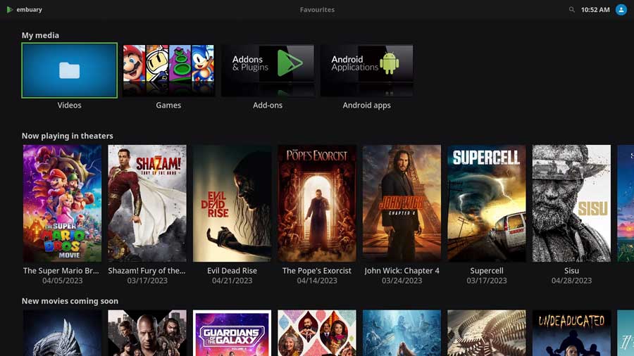
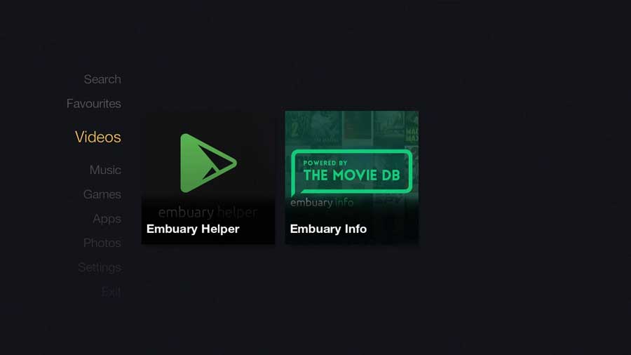
Embuary (Matrix)
Embuary (Matrix) is a Kodi skin that closely resembles the Plex interface. Like Arctic Zephyr Reloaded, it features sections for New Movies Coming Soon and In The Theaters, informing users about the latest film releases. Navigation is straightforward, and the skin allows for displaying a lot of content on the screen simultaneously.
However, the Embuary (Matrix) Settings menu has oversized icons and too much information on the screen simultaneously. I felt that resulted in important details getting lost on the screen.
If you like the Plex experience with easy navigation and movie updates, Embuary (Matrix) is a good option, despite the potential clutter in the Settings menu.
Aeon Nox SiLVO
Aeon Nox SiLVO shares a few similarities with the Aeon MQ9 skin, but it’s not nearly as polished.
For starters, there are no default background images, which can make it feel unfinished. The photos are there, but you’ll need to take an extra step to set them up.
The settings menu looks busy, but overall, navigation is intuitive and user-friendly. Overall, while Aeon Nox SiLVO has some customization, I prefer the Aeon MQ9 skin.

Amber
The Amber Kodi skin reminds me of the Confluence skin, which shares a similar horizontal menu structure. The beautiful images in Amber enhance the overall user experience. However, the Settings menu is out of place compared to the rest of the design.
Despite this, Amber’s text-focused menu makes everything clear and easy to understand. This makes it easier for users to navigate than some other skins. If you like the classic Confluence layout and want a clear, text-focused skin, the Amber Kodi skin is a solid choice.
EllipsisUI
EllipsisUI has a very different vibe than most other Kodi skins on this list. It reminds me of a classic video game console.
The icons jump off the screen, capturing users’ attention. While the background is vibrant, it may get monotonous after some time. The skin features a horizontal menu positioned across the center of the screen.
One advantage of EllipsisUI is that it should run smoothly on devices with limited system memory, making it a perfect choice for users with less powerful hardware.
Aeon Tajo
The Aeon Tajo Kodi skin is positioned between the Aeon MQ9 and Nox SiLVO skins. While Aeon MQ9 has vibrant images that pop off the screen, and Nox SiLVO feels unfinished, Aeon Tajo takes a minimalistic approach that falls somewhere in between.
However, the menu structure is identical to the other skins in the Aeon family.
Aeon Tajo’s background images remind me of music visualizations, providing a unique and captivating appearance. If you want a balance between the high-end Aeon MQ9 and the simplicity of Nox SiLVO, Aeon Tajo offers a compelling compromise.
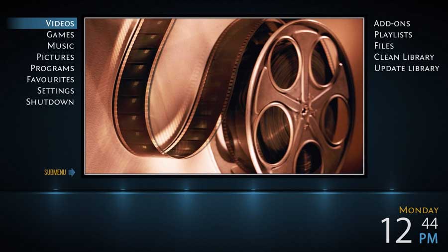
Confluence
If you’ve been using Kodi for a while, you already know about Confluence. It was the original default skin for Kodi and has been around for years. It pioneered the horizontal menu design that many other skins have since adopted.
Confluence has a lightweight, easy-to-use interface, and there’s no shortage of online tutorials to help users make the most of it.
The one drawback is that, after so many years, Confluence may seem a bit outdated compared to more modern skins. However, if you value simplicity, familiarity, and ease of use, Confluence is still a great choice for your Kodi skin.
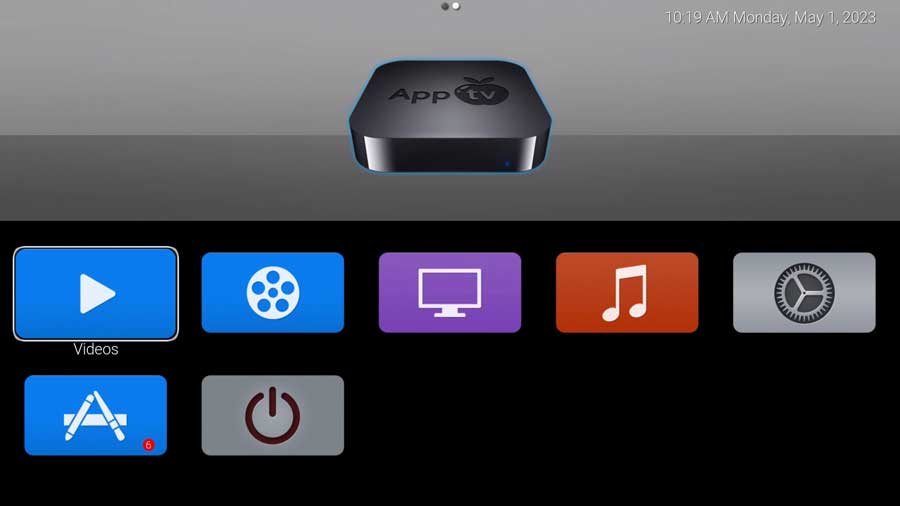
AppTV
The AppTV Kodi skin aims to emulate the Apple TV interface, but instead, it reminds me of a cheap Android box from around 2015.
It features large icons with a limited color palette, which may not be as visually appealing as other skins. The Settings menu is text-based, utilizing a small font that can be difficult to read from a distance.
The AppTV image is displayed on every screen to try to force you to associate this theme with Apple. However, this Kodi skin falls far short of Apple’s sleek design.
TetradUI
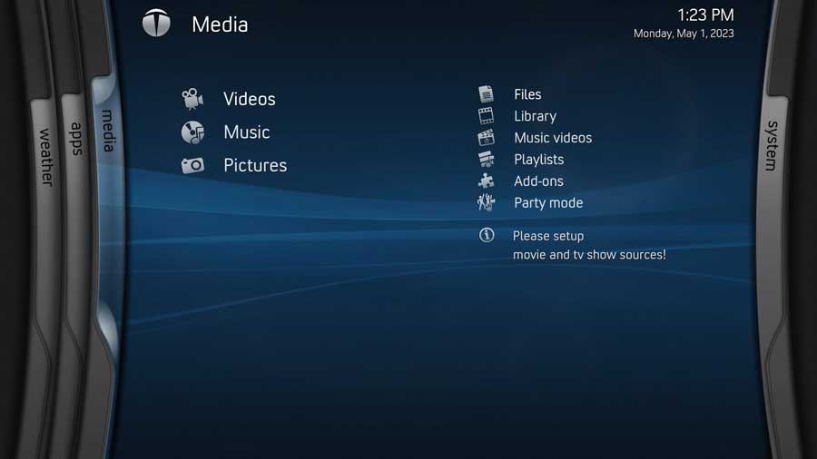
The TetradUI Kodi skin reminds me of the original Xbox Live UI, taking me on a nostalgic journey back to my gaming console days.
The interface consists of four distinct “blades” that can be scrolled through to access content within each section: Weather, Apps, Media, and System.
While this throwback design may evoke fond memories for some users, the menu structure isn’t the most efficient option to navigate around. TetradUI could be a great option if you enjoy the retro feel. Still, it may not be the best fit for users seeking a more functional interface.
Bello 8
Purple. The Bello 8 Kodi skin is very…purple, which may be overwhelming for some users.
It features a horizontal menu, similar to other themes mentioned earlier. However, the space underneath the menu is completely empty, making me think this is wasted space.
With its minimal design, Bello 8 can feel too ‘bare bones’ for those seeking a more visually engaging and dynamic Kodi skin. Users who prefer a simpler interface might appreciate Bello 8. Still, others may find it lacking functionality.
Mimic LR
Mimic LR is a low-resource Kodi skin designed to perform well on devices with limited system memory.
Its design uses a simplistic theme with no background images. However, once you click into the Movies, TV Shows, or Music sections, you’ll still get a dynamic background for your selected content.
Although the icons used are basic, they’re easy to understand what each section of the Settings Menu means without needing to read the captions.
Mimic LR offers a viable option for users with less powerful devices that maintains functionality while conserving system resources. The minimalist design and simple icons make it a good choice for those prioritizing performance over aesthetics.
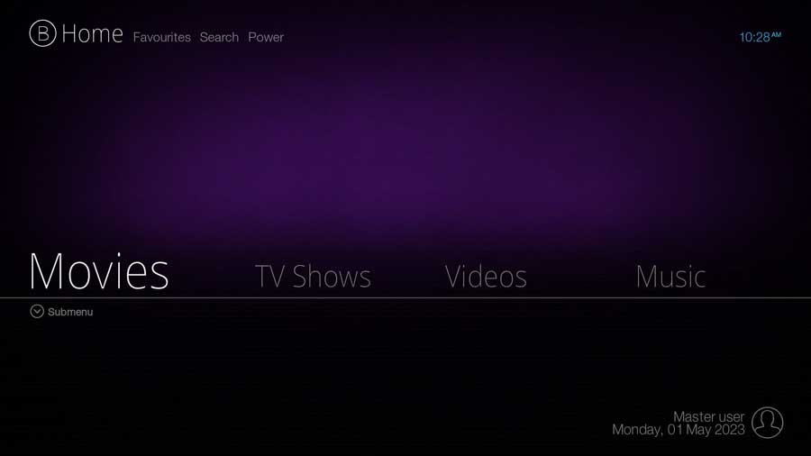
Eminence
Eminence is a Kodi skin that combines the essence of a futuristic theme with an impressive material design icon pack.
The menu is thoughtfully placed along the bottom of the home screen, allowing users to view all options at once without scrolling.
The icons are adequately sized, making them easy to read without wasting valuable screen space. The Settings menu in Eminence is designed to perfection, so I have no complaints.
For users seeking a visually appealing, futuristic Kodi skin with an efficient layout and an impeccable Settings menu, Eminence is an excellent choice to consider.
fTV
The fTV Kodi skin is designed to resemble the older version of Amazon’s Fire OS. However, there’s a reason Amazon transitioned away from that particular design.
This skin feels dated and challenging to use. The options on the extreme edges of the menu blur into the background, making it difficult to read from a distance.
The Settings icons in fTV are huge, resulting in increased scrolling for users navigating the skin.
If you miss the old Amazon Fire OS and want a Kodi skin that mimics it, fTV might be worth considering. But be prepared to deal with a dated design and cumbersome navigation.
Metropolis
Metropolis looks good enough but struggles to commit to a specific design concept.
The center of the screen features a large image corresponding to the menu, while the main menu is on the screen’s left side.
However, the sub-menu for each heading is positioned on the right-hand side of the image, creating a disjointed user experience as the eye constantly scans from one side to the other.
Metropolis may be worth considering if you like the attractive interface but don’t mind a somewhat inconsistent layout. However, you might find navigating this Kodi skin challenging and want something more intuitive instead.
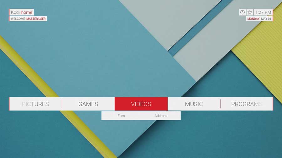
Unity
If you loved your old Google Nexus smartphones and tablets, you’d love the Unity Kodi skin. It replicates the material design backgrounds found on those classic devices.
This skin closely resembles the stock wallpaper from the Nexus 7, offering a familiar visual experience for those who appreciate this style. The home screen features a horizontal menu that conveniently fits all categories on a single screen, minimizing the need for scrolling.
However, the menu colors are a bit jarring, especially in the Settings menu.
While the Unity skin has its unique appeal, it may not be the best option for those wanting a more subdued or visually calming interface.
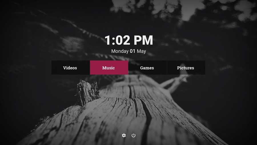
Pullicid
Pullicid is a basic Kodi skin featuring a small, centralized menu system for Videos, Music, Games, and Pictures. Upon selecting one of these categories, the content transitions to a scrolling menu at the bottom of the screen. The Settings menu in Pullicid is text-based and spans across the center of the screen.
This Kodi skin looks good, but there seems to be a disconnect between the menu styles.
Although this skin has some plusses, the overall flow from one screen to another could use some improvement. For users who value simplicity and don’t mind the disjointed menu transitions, Pullicid might still be worth a look.
Quartz
Quartz is about as bare-bones a Kodi skin as you can get.
Its a lightweight skin designed to prioritize showcasing fan art while maintaining a no-frills user interface. Its intuitive user interface and highly customizable home screen cater to users who prefer simplicity.
It features a simple black center menu, unremarkable font, and a high-contrast Settings menu.
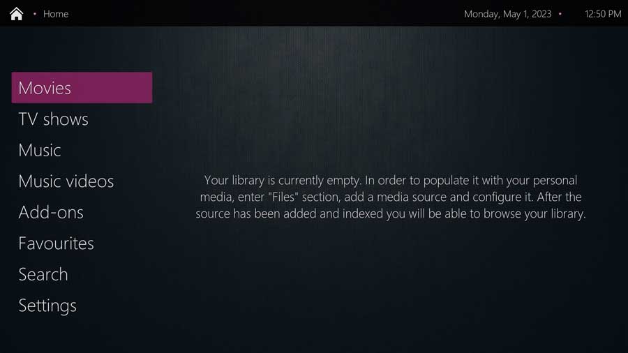
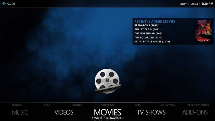
Rapier
Rapier is a Kodi skin with a horizontal menu at the bottom of the screen. As you scroll through each category, it displays the total number of titles and the count of unwatched items in that particular category. Additionally, a popup box showcases recently added titles within the selected section.
This user-friendly skin provides easy navigation and quick access to content, making it a practical choice for those who prefer a straightforward and informative interface. The combination of simplicity and utility makes Rapier a good Kodi skin for users who want efficient content organization and easy access.

After a brief hiatus from the industry he's back at the helm of AndroidTVNews.com to bring Android TV and TV boxes to the forefront of the streaming world.
When he's not writing, he spends as much time as he can with his beautiful wife and his bulldog.
- How to set up and use Stremio with Real-Debrid on Android TV [2024] - August 18, 2024
- How to Install Kodi Diggz Xenon Plus & Free99 Build [March 2024] - March 3, 2024
- How to Enable Unknown Sources on Chromecast with Google TV [2025] - October 30, 2023